Examples of Web & Intranet Sites
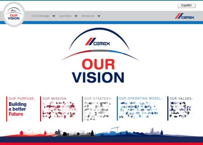
A story line template for Cemex for their Intranet.
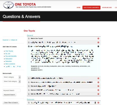
A custom FAQ solution developed for Toyota. Keyword, category, and subcategory search provided running off XML data for one of their Drupal websites.
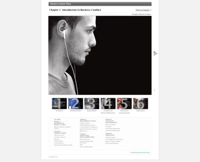
A 60+ page business conduct policy, in eight different languages, for an American multinational technology company headquartered in Cupertino, California.
A custom WordPress Template partnered with Sidekick Associates
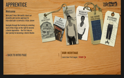
An interactive training module for Levis employees on their Intranet.
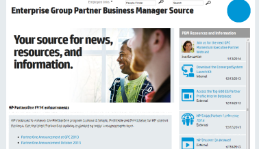
Nearly 50 different Intranet sites with custom solutions and designs for HP.
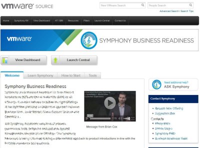
Several template and site enhancements for VMware's Intranet